Simple & Clean
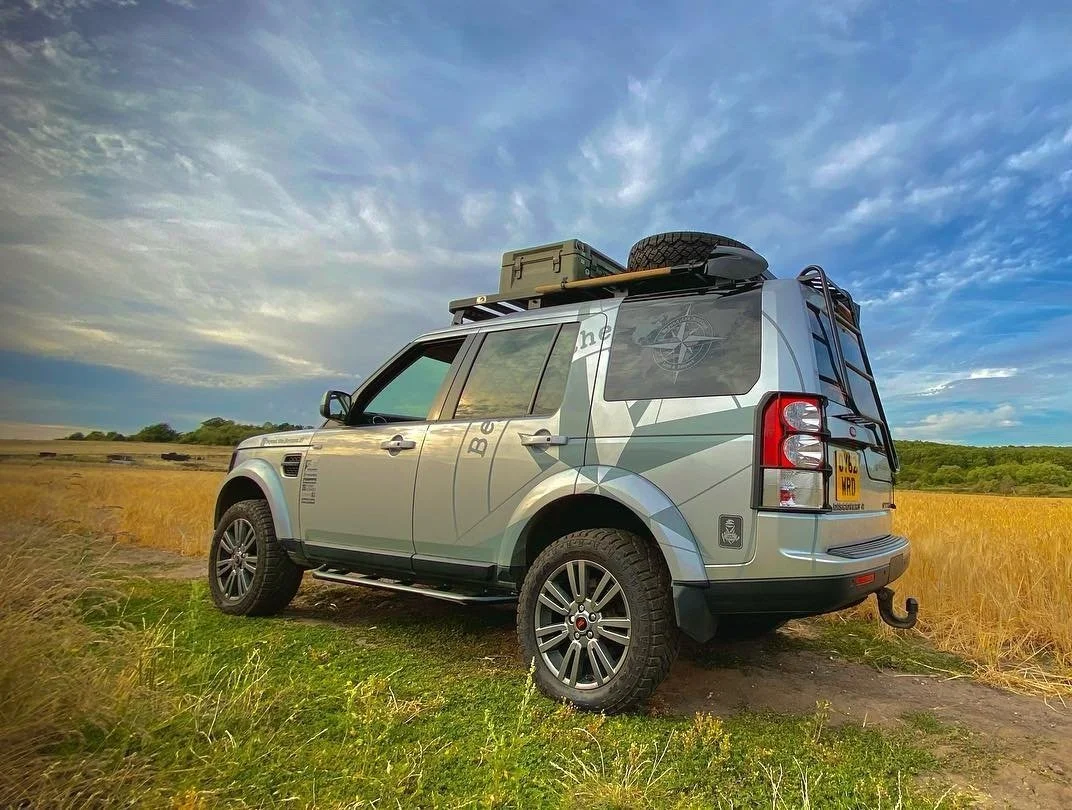
Like in many other aspects of our lives, we prefer a simple and clean style. What does this mean? We favor softer colors and minimalist designs—nothing too flashy or overly bright as the primary elements of the design. We also value clean lines and shapes; for example, a shorter awning that doesn’t extend from the roof rack to the front, avoiding large, boxy rooftop tents, and generally anything that protrudes from the main silhouette of the vehicle.
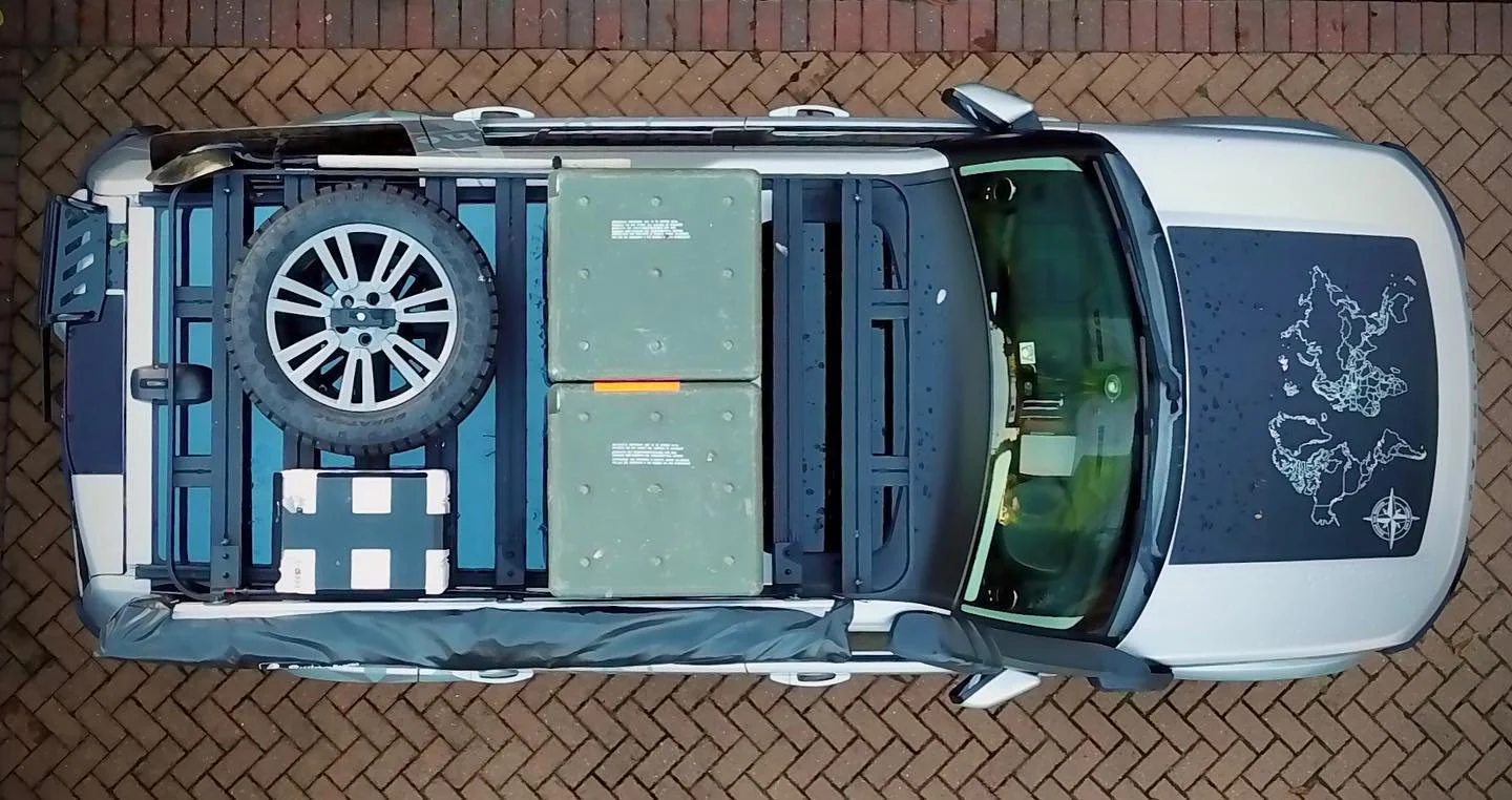
From a practical standpoint, we’re not fans of bolting everything onto the exterior of the car—items like axes, shackles, saws, and so forth. Similarly, we see no reason to mount DC chargers, inverters, or other equipment on the surfaces inside the vehicle just to show they’re there. Items that you might only need every few weeks or months should be stored out of sight to avoid drawing unwanted attention—whether at border crossings or from potential burglars. Machetes, axes, and similar tools are good examples. Unfortunately, influenced by social media and paid product endorsements a show cars, many people outfit their vehicles more as showpieces than as practical living spaces. Of course, there are exceptions—some items, like Maxtrax, shovels, or large dirty gear, simply cannot be hidden inside.
Our general approach is to reveal less than what is actually in or on the vehicle. While it’s impossible to completely disguise an overland vehicle loaded with gear—even if some believe they can be “stealthy” with solar panels, oversized wheels and tires, and plastic covers on water and electrical connection points—you can still be creative. Use softer colors for boxes and cases, pack items neatly out of sight—like our firepit, which fits inside the spare wheel mounted on the roof—and coordinate accessory colors to create a cohesive, unified look from a distance.
Decals & Colours
Everyone loves stickers — and coming from the advertising industry, so do I.
Even before we actually purchased our Discovery, we already knew what it would look like — what gear we’d install, which decals we’d use, and exactly where everything would go.
In our opinion, the Discovery is a beautiful car even in its stock form, and we didn’t want to overdo it. Our goal was to maintain its elegance while showing that it’s capable of doing extraordinary things — taking us on adventures and sharing joy along the way.
We love smart, slick design, the kind that doesn’t reveal everything at once. At first glance, it looks like a tough vehicle with a few stickers — but when you look closer, you begin to notice the small details (which we love).
To achieve this effect, we used two shades of grey:
A light grey (almost identical to the car’s silver paint) for the main design — our logo as a subtle background element on both sides of the Disco. From certain angles and lighting conditions, it becomes nearly invisible.
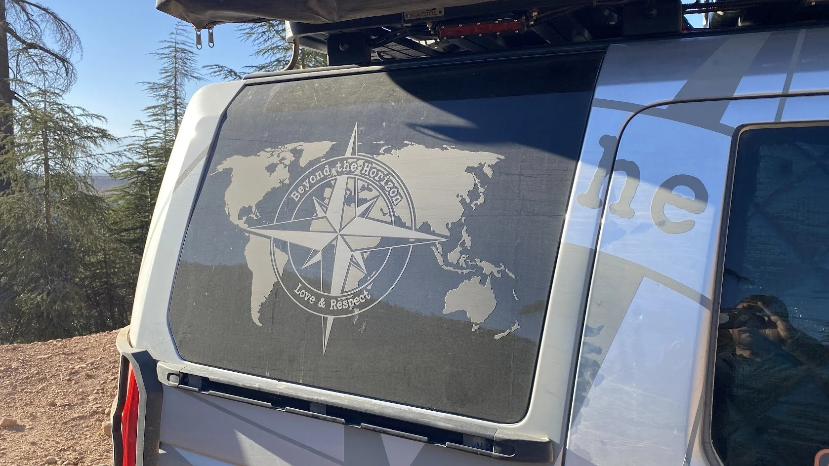
A darker grey (about 80% black — visible and readable, but not as bold or harsh as true black) was used for our Instagram handle and small logos of the gear brands we use. This same dark grey is combined with matte black on both rear side windows, featuring a world map and our logo. The contrast between the glossy window and the matte black/dark grey creates a sleek effect — noticeable but never too loud. Also creates amazing effect when dusty.
The same approach was used for the bonnet decal, which includes a map of the world with highlighted countries we’ve visited, along with unskippable country flags. These elements are clearly visible up close and often spark conversation, but they never disrupt the overall clean look.
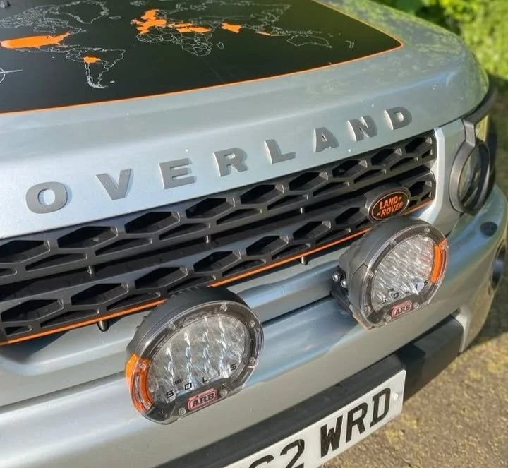
The final touch — the cherry on top — is “our” orange.
Just like on this website, you’ll find tiny orange accents on the car:
Land Rover logos on the grille and tailgate, wheel caps, the snorkel grille, spotlight bezels, recovery points, and a thin orange stripe outlining the bonnet decal and the grille. You might not notice them at first glance — but if they were gone, you’d feel like something was missing.
And last important bit - same as any other work on our car - we made all our stickers ourselves - from design to actual vinyl cutting and application. You can buy our stickers and support our mission here.
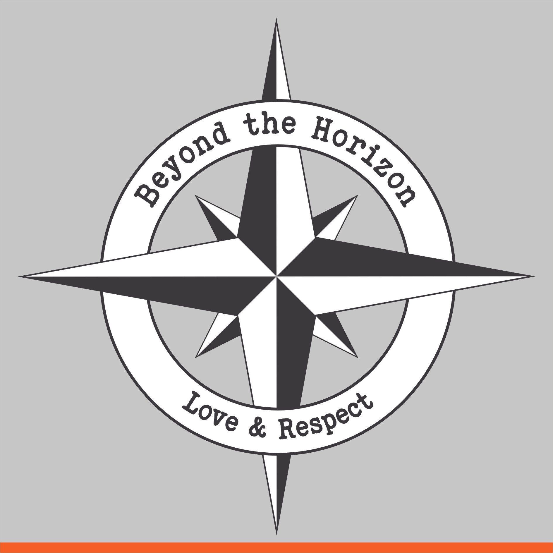
Name, Logo & motto
We think Beyond the Horizon is quite self-explanatory — it’s about going beyond borders and limits. You can’t ever truly reach that final point — as you move forward, the horizon moves with you. But along the way, you can explore, learn, and experience things firsthand. Still, you will never learn everything, you will never know everyone, and even places you’ve visited before will look different the next time you see them.
But you can be open-minded, willing to learn from others, share what you’ve learned elsewhere, and try to understand local circumstances — the what, the how, and the why behind what’s happening. You may encounter different steps or methods than you expected.
And finally, appreciate nature, flora, and fauna. Treat people and all living beings with respect — simply, Love & Respect.
The Logo Itself Combines Two Main Features:
Compass Rose – A symbol of guidance and direction, staying on course especially in challenging times, and finding the right path or purpose in life. It’s also a well-known symbol of travel, discovery, and curiosity.
Circle – Represents unity, infinity, and balance. When wrapped around the compass rose, it symbolizes a complete journey or navigation through life or the world — simply, finding your place.
Color & Style Choices - Black (90%) and white palette – timeless, clean, and powerful. It reinforces clarity, purpose, and simplicity. Orange underline – Orange often symbolizes energy, creativity, and determination — a vibrant foundation for the message.